Why your brand looks cheap is a question most business owners never think to ask. Your product is good. You know it is. But customers are leaving your page, scrolling past your posts, and choosing a competitor whose product is honestly no better than yours.
The reason is almost never the product. It is how your brand shows up before the product gets a chance to speak.
This is not a budget problem. It is a perception problem. And perception is something you can fix.
The 3 Second Rule Nobody Talks About
Research from Missouri University of Science and Technology found that it takes a person 0.2 seconds to form a first visual opinion of a brand, and just 2.6 more seconds to confirm or change that opinion.
That is less than 3 seconds total.
In those 3 seconds, a potential customer decides whether your brand feels trustworthy, premium, amateur, or irrelevant. They do not read your product description. They do not check your reviews.
They feel something. And that feeling drives their next decision.
Most businesses put everything into the product and almost nothing into the feeling. That gap is where sales are lost.
Why Your Brand Looks Cheap: The Real Reasons
Inconsistent Fonts
Using three different fonts across your logo, social media, and packaging is one of the fastest ways to signal that your brand was put together by accident rather than designed with intention.
Premium brands pick one or two typefaces and use them everywhere. Always. Without exception.
When your Instagram post uses a different font from your business card, the brain registers it as unprofessional before you can even explain why.
Colors That Were Guessed, Not Chosen
A color palette is not about picking colors you personally like. It is about picking colors that communicate the right thing to the right people.
Green communicates health and trust. Black communicates premium and authority. Orange communicates energy and accessibility.
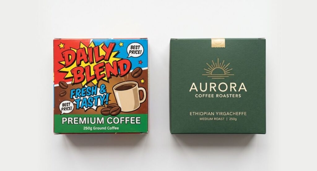
When colors are chosen without that thinking behind them, the result does not just look random. It makes people feel uncertain about the brand, and that uncertainty transfers directly to the product inside the packaging.
A Logo Trying to Say Too Much
Amateur logos try to communicate everything at once. They include the industry, the service, the location, the name, and sometimes a tagline, all compressed into one mark that ends up saying nothing clearly.
The most recognizable logos in the world are simple. Nike. Apple. Zara. They say one clear thing and trust the brand to do the rest.
Complexity in a logo does not signal capability. It signals insecurity.
No System Behind the Design
The single biggest difference between a brand that looks professional and one that looks cheap is not any individual design element.
It is consistency.
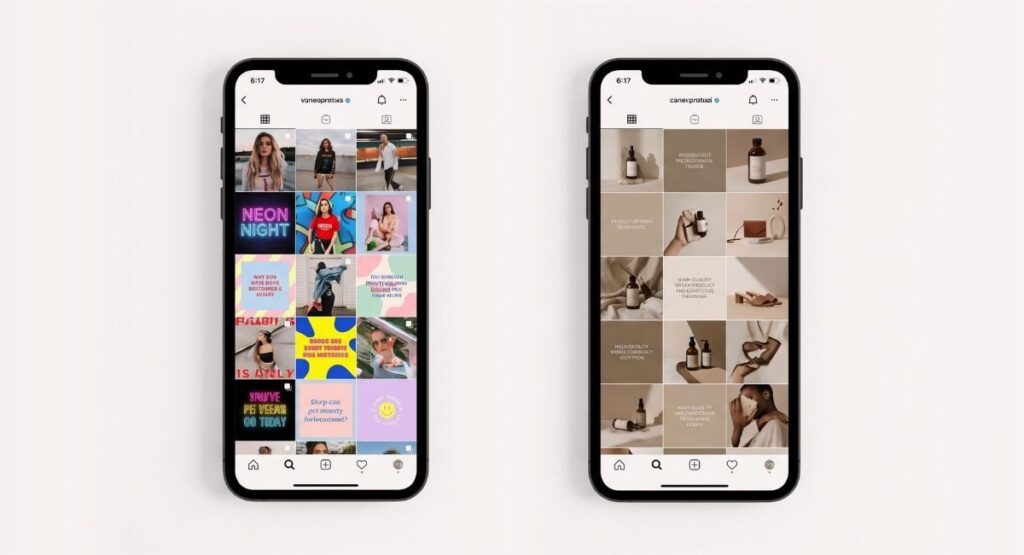
A brand with a clear system, the same colors every time, the same fonts every time, the same spacing and tone every time, builds recognition. Recognition builds trust. Trust builds sales.
Most growing businesses redesign their logo every year or change brand colors with every season. This does not signal growth. It signals instability.
The Real Cost of Looking Cheap

Looking cheap is not just an aesthetic problem. It is a revenue problem.
According to a Lucidpress brand consistency report, businesses that present their brand consistently across all platforms see an average revenue increase of 23 percent compared to those that do not.
23 percent is not decoration. That number shows up in your sales, your repeat customers, and your ability to charge what your product is actually worth.
When your brand looks cheap, you attract clients who haggle. When your brand looks premium, you attract clients who respect your pricing.
The brand is not separate from the business. It is the business.
How to Start Fixing It Without Rebuilding Everything
You do not always need to throw everything out and start over. Sometimes three focused changes shift perception significantly.
Start with your fonts. Pick two and commit to them everywhere. One for headings, one for body text. Make that decision once and stop changing it.
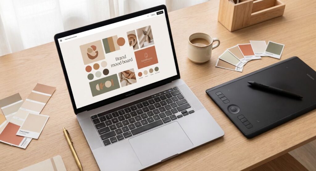
Next, define your color palette. Three to five colors maximum. A primary, a secondary, and one or two neutrals. Write them down as exact hex codes and use nothing else.
Then look at every touchpoint where your brand appears and ask one question.
Does this feel like it came from the same place as everything else?
If the answer is no, find the gap and close it. Consistency is not about perfection. It is about coherence.
When to Bring in a Professional
There is a point where DIY fixes stop being enough. If your business is growing and your brand is not keeping up with it, that gap is costing you clients you will never know you lost.
A complete brand identity system, built by someone who understands how design communicates rather than just how it looks, is one of the highest return investments a growing business can make.
It is not a cost. It is the foundation everything else is built on.
Your product deserves to be judged for what it actually is. A brand that looks cheap makes that impossible.
The good news is that perception is something you can change. You do not need a large budget to start. You need intention, consistency, and the right decisions made in the right order.
If you want to understand exactly where your brand is losing people before they even speak to you, we are glad to take a look.
Thinking about your brand identity? Read our guide on the social media design mistakes that quietly damage brand growth, or explore how we approach brand identity at Everwon Studio.
Frequently Asked Questions
Why does my brand look unprofessional?
Most unprofessional brand appearances come from inconsistent fonts, unplanned color choices, and a logo trying to communicate too many things at once. A brand looks professional when every visual element follows a clear and consistent system applied across every platform and touchpoint.
How much does brand identity design cost?
Brand identity design ranges from basic logo work to a complete brand system including logo, guidelines, color palette, and typography. Pricing varies significantly by studio, scope, and market. What matters most is finding a partner who builds systems designed to grow with your brand, not just someone who delivers a logo file.
Can I fix my brand without a complete redesign?
Yes. Start by standardising your fonts and colors across all platforms. Consistency alone can significantly improve how professional your brand appears. A full redesign is not always necessary, especially in the earlier stages of building a business.