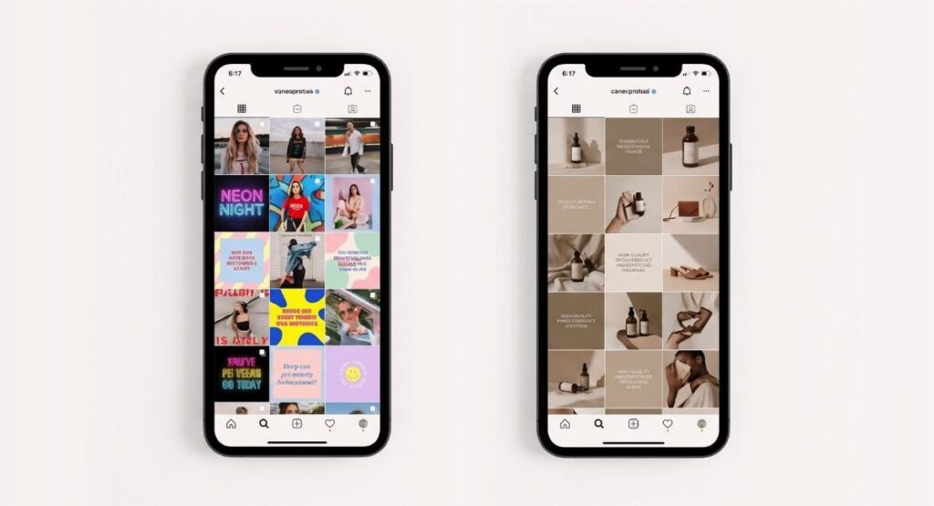
Social media design mistakes brands make every day are not always obvious. Most of them do not announce themselves. They just quietly cost you followers, trust, and clients you will never know you lost.
When a potential customer lands on your Instagram page, they decide something about your brand in the first five seconds. Not from your captions. Not from your follower count. From how your feed looks.
After working across social media design for brands in food, fashion, real estate, and e-commerce across multiple markets, the same mistakes appear every time. They are not specific to one industry. They are patterns. And they are all fixable.
Here are the ones we see most and what they are actually costing you.
Social Media Design Mistake 1: Posting Without a Visual System
This is the most common and most damaging mistake growing brands make on social media.
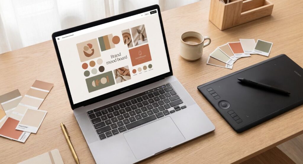
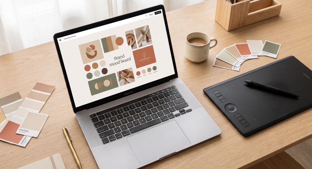
A visual system is not complicated. It is a set of decisions you make once and then follow every time. Your brand colors. Your typography. Your image style. Your layout grid.
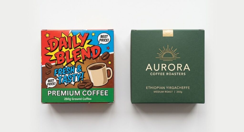
When those decisions change with every post because someone is designing from scratch each time, the feed looks like it belongs to five different brands.
Your audience does not consciously notice this. They just feel that something is off. The brand does not feel stable. And an unstable brand does not feel safe to buy from.
The fix is a social media template system. A set of pre-designed layouts that use your brand colors, fonts, and visual language consistently so every post feels like it came from the same place even when the content is different.
Social Media Design Mistake 2: Overloading Every Post With Text
The posts that stop people scrolling are not the ones with the most information. They are the ones with the strongest visual. One clear image. One clear idea.
Text-heavy posts signal that the brand does not trust its visual enough to let it do the work. And if you do not trust your visual, your audience will not either.
The rule that works is simple. If the message requires more than 12 words on the image itself, the visual is not strong enough to carry it. Fix the visual first, then worry about the words.
Long-form information belongs in the caption. The image has one job. Make someone stop scrolling.
Social Media Design Mistake 3: Using Templates Without Making Them Yours
Canva is a useful starting tool. It is also the reason a significant portion
of brand content across every industry looks identical.
When thousands of brands use the same template library, the visual language
of those brands becomes the same. Your competitor in the same space is likely
using the same template you used last Tuesday.
Templates are starting points, not final outputs. A template used without
customization to your brand colors, your typography, and your visual style does
not represent your brand. It represents the template platform.
Every template you use should be customized enough that the original
template is completely unrecognizable behind it. If someone can identify the
source template in your post, the work is not finished.
Social Media Design Mistake 4: Low Quality Images on a High Quality Product
A product shot taken under office lighting with a phone held at the wrong angle communicates one thing very clearly. This brand does not take itself seriously.
You do not need a professional studio for every post. But you do need consistent, clean, well-lit imagery that presents your product or brand at its best.
Natural window light, a clean background, and a stable camera can produce images good enough for social media. What it cannot compensate for is a cluttered background, bad lighting, or a blurry frame.
If your images consistently look low quality, AI product photography tools can now produce clean professional visuals from a basic product photo and a description. For brands not yet budgeting for regular studio shoots, this is a practical solution that delivers real results.
Social Media Design Mistake 5: Looking Like a Different Brand on Every Platform
Your Instagram looks one way. Your Facebook looks different. Your website uses completely different colors. Your LinkedIn profile uses a different logo version.
To a customer moving between these touchpoints, this reads as either
multiple businesses or one business that has not figured out its identity.
Neither impression builds trust.
Brand consistency across platforms is not about posting identical content
everywhere. It is about making sure that wherever someone encounters your
brand, it feels like the same brand.
The same logo. The same color palette. The same visual tone. Even when the
content format is different, the visual identity should be immediately
recognizable.
Social Media Design Mistake 6: Designing for Yourself Instead of Your Audience
This is the most honest point on this list and the most uncomfortable.
Most social media design decisions are made based on what the business owner personally likes. What color they prefer. What style appeals to them.
But your audience is not you.
A premium brand run by someone who loves bold maximalist aesthetics might need clean, minimal, soft-toned content because that is what their specific audience responds to.
Good social media design is not about taste. It is about understanding your audience well enough to give them a visual language that makes them feel comfortable and seen, even when it is not the direction you would personally choose.
The best creative partners are the ones who can separate personal preference from what will actually work for your specific audience in your specific market.
What a Proper Social Media Design System Looks Like
A social media design system should include these elements at minimum.
A set of post templates in three to five formats covering announcements, products, quotes, and promotional content.
A defined color palette with exact hex codes applied to every post without exception.
A typography system with one heading font and one body font used consistently across all content.
An image style guide defining the photography mood, lighting direction, and visual treatment for all brand imagery.
A story template set that matches the feed aesthetic but is optimized for the vertical format.
When these elements are in place, every new piece of content has a clear framework. The creative energy goes into the message, not into reinventing the visual system with every post.
Social media design mistakes brands make are almost always fixable once you know what to look for.
The underlying problem is almost never budget. It is consistency, intention, and a clear visual system applied without exception.
If your social media has been inconsistent and you are not sure where to start fixing it, that is exactly the kind of problem we work on at Everwon Studio.
Want to build a proper visual system for your brand’s social media? Explore our social media design services or read our guide on why your brand might be losing customers before they even reach your page.
Frequently Asked Questions
What are the biggest social media design mistakes brands make?
The most common social media design mistakes brands make include posting without a consistent visual system, using unmodified templates, overloading posts with text, using low quality images, and designing based on personal preference rather than audience psychology. All of these are fixable with the right visual system in place.
How often should a brand post on Instagram?
Consistency matters more than frequency. Three to four posts per week with a strong consistent visual system will outperform seven posts per week with inconsistent low quality design every time. Start with a volume you can maintain at a high quality level and build from there.
How do I make my social media feed look more professional?
Start with three decisions. Lock your color palette to two or three brand colors and use them on every post. Lock your fonts to one heading and one body typeface applied consistently across all content. Fix your image quality by shooting in natural window light against a clean background. These three changes alone will significantly improve how professional your brand looks across every platform.